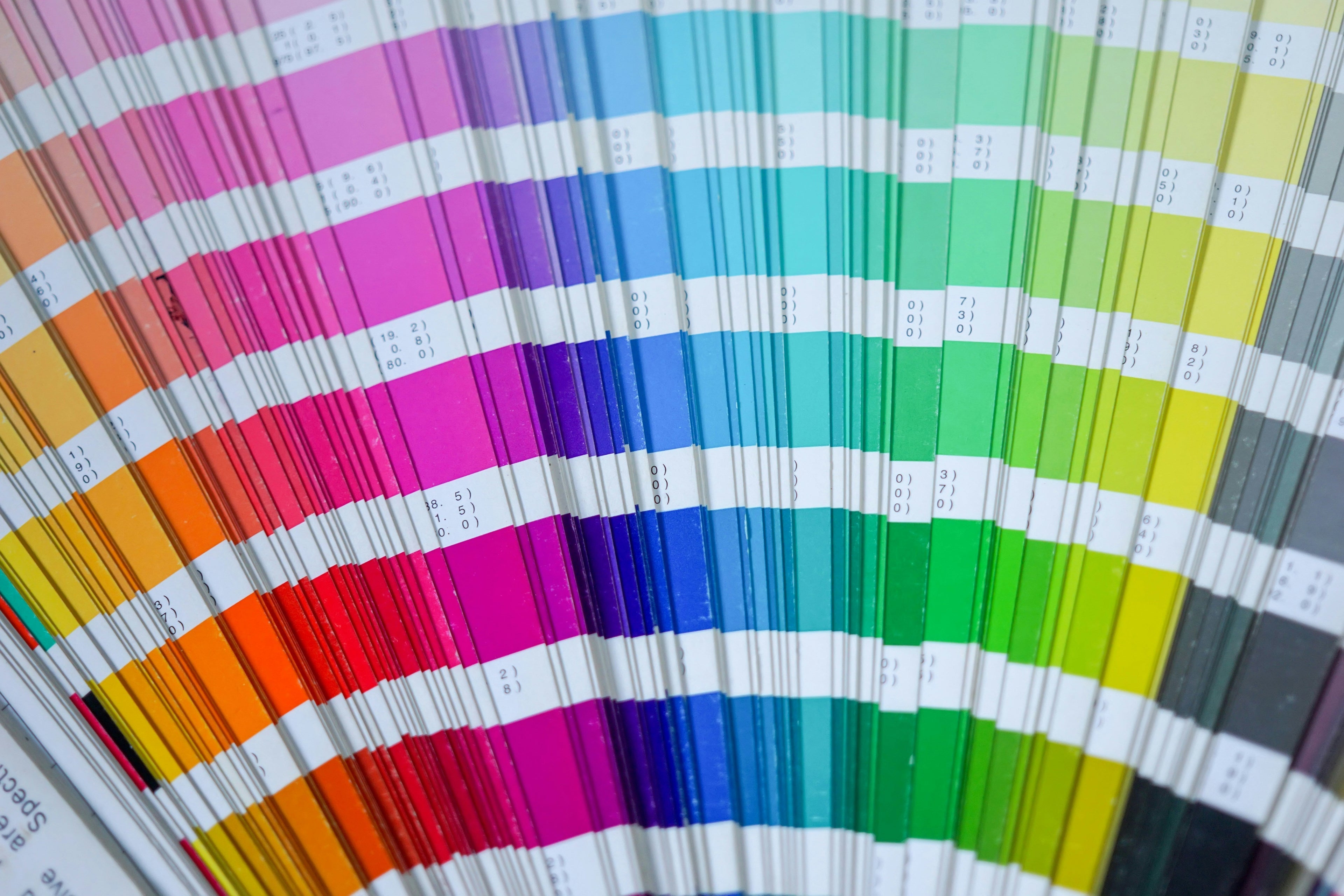
Why Don’t My Print Colours Match My Screen? The Truth About Colour Accuracy
You’ve spent hours perfecting your design, choosing the perfect colours, and making sure everything looks just right on your screen. You send it off to print, excited to see the final product—only to open the box and find that the colours don’t look the same.
Maybe your deep navy looks more like royal blue. Your soft pastels have printed too dark. Or your bright, vibrant red seems a little… dull.
What went wrong?
Before you panic and assume it’s a printing mistake, let’s talk about why colours look different in print than they do on your screen—and what you can do to get the most accurate results
Understanding Colour: Digital vs. Print
The first thing to know? Your screen and your printed materials speak completely different colour languages.
Screens use RGB (Red, Green, Blue). Every colour you see on your monitor, phone, or tablet is created using light. These colours are vibrant, backlit, and have a much wider range than what can be printed.
Printers use CMYK (Cyan, Magenta, Yellow, Black). Instead of light, print colours are created using ink. This means some digital colours simply can’t be replicated in print with 100% accuracy—especially bright neons or deep, rich blacks.
This is why what you see on-screen is never a perfect match to what comes out of the printer.
The Most Common Reasons Colours Print Differently
Even if you’re aware of the RGB vs. CMYK difference, there are other factors that affect colour accuracy in print.
1️. Your Design Wasn’t Set Up in CMYK
One of the biggest culprits? Designing in RGB instead of CMYK.
Most design software (like Photoshop, Illustrator, or Canva) defaults to RGB mode because it’s optimised for digital screens—not print.
So, when you create a file in RGB and send it to print, the colours have to be converted to CMYK—and during this conversion, you can lose some of that vibrancy.
💡 How to avoid this: Always set your document to CMYK before designing. If your software doesn’t allow CMYK mode, ask for a CMYK proof before printing.
2️. Your Screen’s Brightness & Settings Are Misleading
Ever noticed how a photo looks different on your phone compared to your laptop? That’s because every screen has different brightness, contrast, and colour calibration.
If your screen is set to extra brightness, colours will always look more vibrant than they will in print.
💡 How to avoid this: Lower your screen brightness to around 50% when designing to get a more realistic preview of how the colours will appear in print.
3️. The Paper Stock Changes the Colour Appearance
The same colour printed on different types of paper can look completely different.
-
Uncoated Paper (like letterheads and notepads) absorbs more ink, making colours appear softer and slightly duller.
-
Gloss Paper enhances colours, making them appear more vibrant.
-
Matte Paper sits somewhere in between—reducing shine but keeping colours crisp.
💡 How to avoid this: If colour consistency is critical, request a printed proof on the exact paper stock you’ll be using.
4️. Colour Matching Across Different Printers & Inks
Not all printers are created equal. Different printing machines, ink brands, and even humidity levels can slightly affect colour output.
For example:
-
Digital printing is great for small runs, but may have slight colour variations between jobs.
-
Offset printing offers more precise colour matching, especially for large-scale projects.
-
Spot colours (Pantone) ensure exact colour accuracy but can be more expensive.
💡 How to avoid this: If you need consistent branding across multiple print jobs, consider using Pantone (PMS) colours instead of CMYK. These pre-mixed inks ensure precise colour accuracy, no matter where or when you print.
How to Get the Best Colour Accuracy in Print
We get it—when you’re investing in printed materials, you want them to look exactly as you envisioned. While some variation is inevitable, here’s how to get as close to perfect as possible.
✔ Design in CMYK, not RGB. Avoid automatic colour conversion surprises.
✔ Lower your screen brightness to get a more realistic preview.
✔ Choose the right paper stock—uncoated vs. gloss vs. matte.
✔ Request a printed proof if colour accuracy is crucial.
✔ Use Pantone colours for 100% consistency in branding.
At The Print Group Australia, we help businesses get the best possible colour results in print—offering expert guidance on file setup, stock selection, and print techniques to ensure a flawless final product.
Need help getting your colours right? Contact us today—we’ll make sure your next print job is perfect, down to the last detail.

